How much further could grad students progress if data analysis were more powerful? I’m used to doing a lot of my analysis in Python or VMD. (VMD is a molecular simulation software package.) However, I wanted to get fine insights on a data set with ~25,000 data points. For example, in the dense scatter plot below, I wanted to quickly see: which molecules represent the outliers?
The above plot was generated in Python. However, it’s not dynamic; I can’t hover over specific points and get more details. That can be done, using the Plotly package (among others). The reason I didn’t pursue this undertaking with Plotly is that there isn’t an easy way to have image pop-ups on interactive Plotly plots.
So, I turned to a Business Intelligence tool, TIBCO Spotfire. Academics can apply for a free, one-year license! I worked with Spotfire a bit before, in an internship several years ago. I didn’t have much to compare it against then, but it’s been so valuable for me in the past two days.
Since it was a bit of an undertaking to actually get the image hover to work, here’s a step-by-step guide for anyone trying to do the same thing:
Step 1: Upload images to a web server
I used the server for this website, Pocketful of Lint. There are many websites for which you can store images (Google Photos, SmugMug, Imgur, etc.). However, make sure the the link has a consistent format, for example: https://www.website.com/FILENAME.png
Note: There should be a way to do this with local images. I think that might be more complicated.
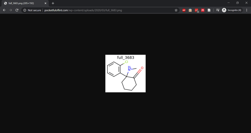
Step 2: Add the image identifier to the data table
- Starting with my data in CSV format, I opened it in Excel. I added a column corresponding to the image identifier. For example, the corresponding cell to the example figure in Step 1 would say:
full_3683. I did not fill these in by hand but used a simple Python script to loop over my molecules and print out their titles. Then I copied the list of strings as a new Excel column.
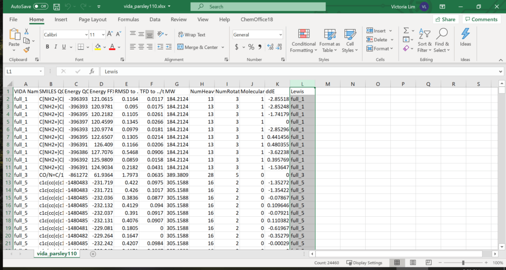
Step 3: Open the data in Spotfire
Spotfire can open .xlsx files and import the data pretty easily. I started with adding a table visualization.
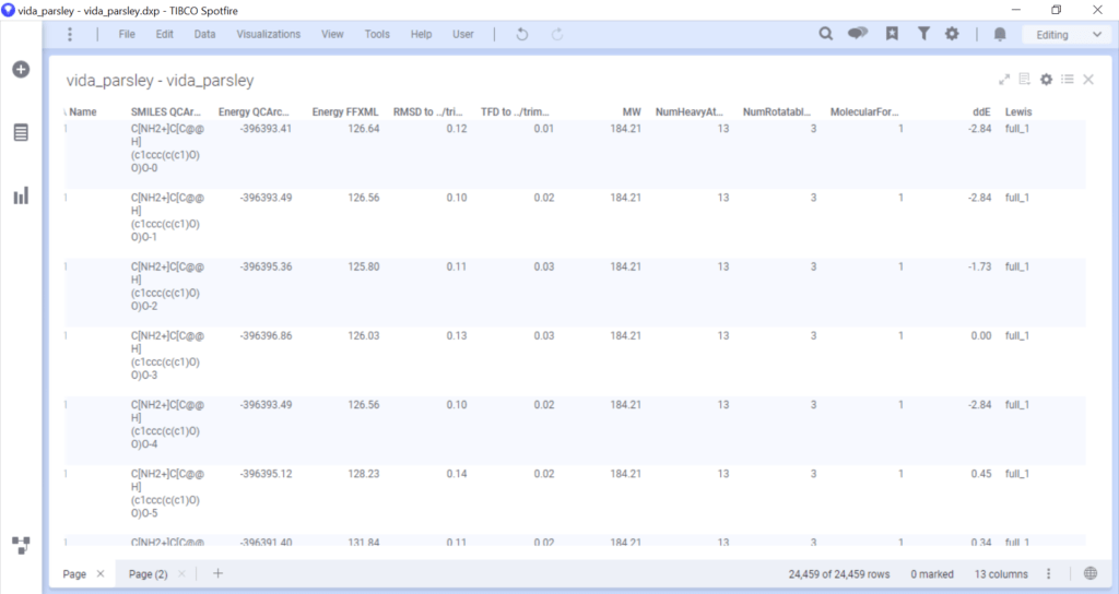
Step 4: Render figures from URL in table
This step is optional, for if you want a table view (highly recommended).
- Click the gear icon at the top right.
- Select “Columns” on the left.
- Click the column with the image identifier text. (Mine is “Lewis”.)
- The Renderer option should default to “Text”. Change that to “Image from URL”.
- Click on Settings… below the Renderer option.
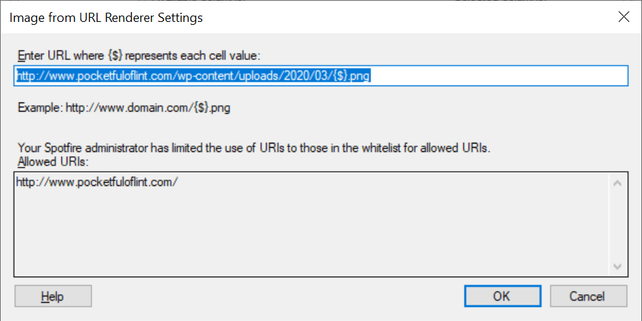
- Now type in that consistent URL prefix but replace the filename with the {$} wildcard. In my example, I typed in:
http://www.pocketfuloflint.com/wp-content/uploads/2020/03/{$}.png
Note: This step can be iffy. By default, I could not press OK since it was grayed out. The reason for that is that URL whitelists are turned on by default. So I could only specify a URL that was listed as allowed. Some versions of Spotfire allow you to disable the whitelist completely, or add your own allowed URLs. However, in my version, TIBCO Cloud Spotfire Analysis 10.8.0, this can only be done by contacting technical support. More details here. Their response to me: “It is not possible to disable the whitelist requirement, and all users of our hosted Cloud environment must put in a new request if they need to add another URL to your whitelist.”
Earlier and/or non-cloud versions might be able to do it without the need to contact support such as described here.
The images should now show up in your table.
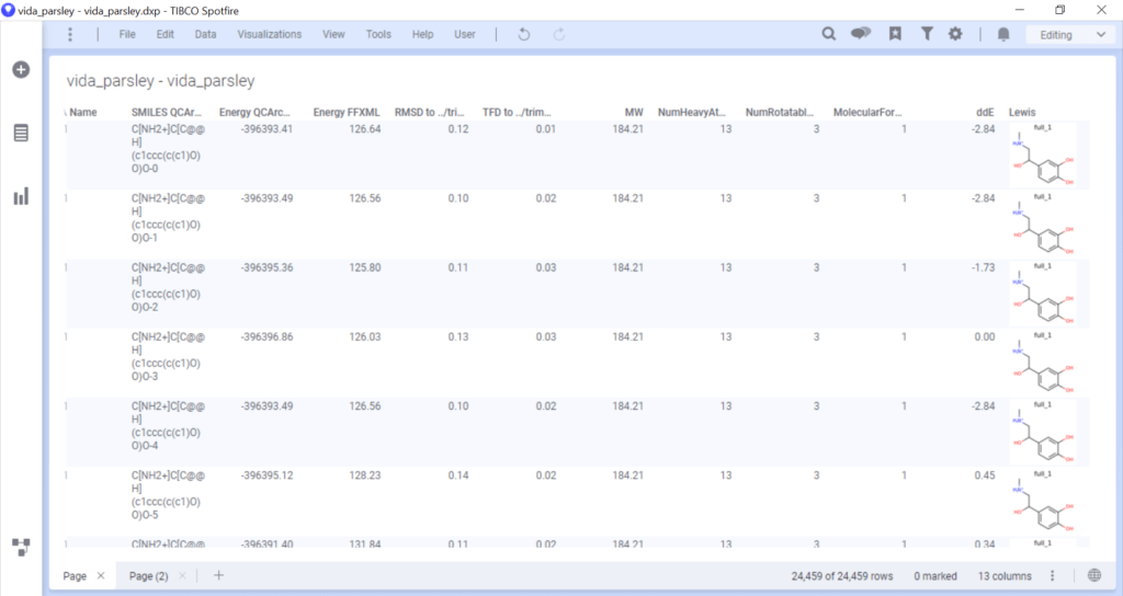
STEP 5: Create a visualization
I created a scatter plot in which I set marker color as the molecular charge and set the marker size to reflect molecular weight.
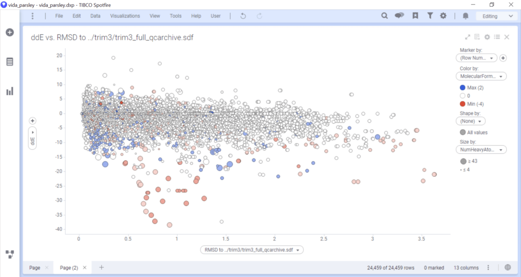
Step 6: RENDER FIGURES FROM URL IN PLOT
Note that this is almost identical to Step 4 if you rendered figures in a table visualization. While some steps may seem redundant, be sure to follow them all as the table rendering does not carry over to the plot rendering.
- Click the gear icon at the top right.
- Select “Tooltip” on the left.
- Click “Add…”
- Select the column with the image identifier text. (Mine is “Lewis”.)
- Under “Show as”, select “Image from URL”.
- Click on “Settings…”
- Now type in that consistent URL prefix but replace the filename with the {$} wildcard. In my example, I typed in:
http://www.pocketfuloflint.com/wp-content/uploads/2020/03/{$}.png
Note: If you can’t click OK because it has been grayed out, see step 4.6 above. - If desired, change the size of the image by moving the slider.
- Click OK.
- My default setting for “Tooltip format” is on “Value names and values”, and that’s what I left it on.
Now you should be able to see the rendered image when hovering over any scatter plot point! This was all done in TIBCO Cloud Spotfire Analysis 10.8.0. If you have any questions or want some example data to try, let me know. I’d be happy to send you my Excel spreadsheet or my Spotfire analysis file.
References
- Spotfire Video Tutorial — this covers what was discussed in Steps 4 and 6. You can also add images as axis labels such as in a bar plot. See the YouTube video for more information.
